
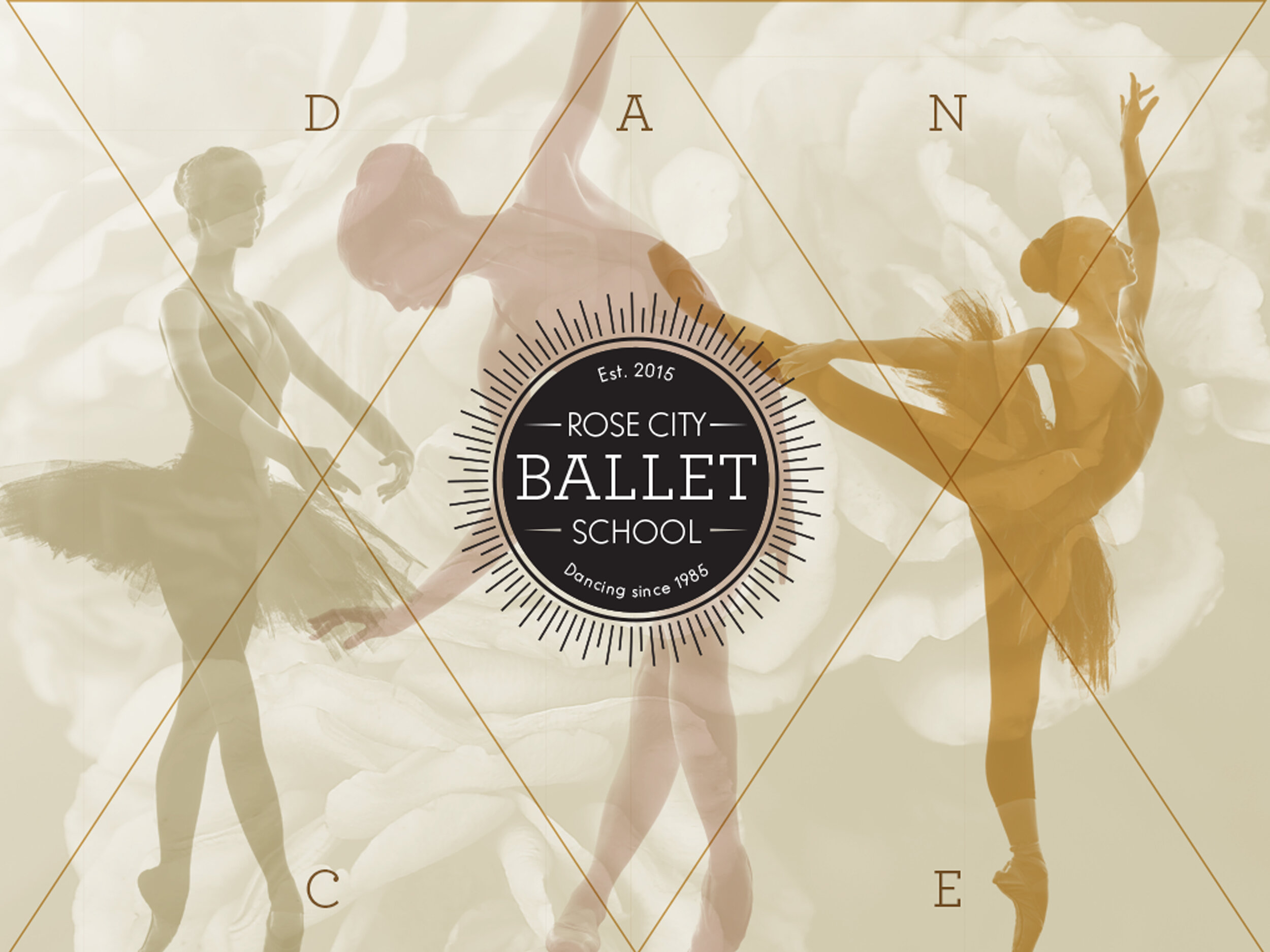
Graceful Geometry Plus the Sun King Equals Ballet
This brand was founded on the very history of ballet itself. We dug into the history all the way back to King Louis XIV (14th). King Louis was called the sun king after appearing in ballet as Apollo the sun god. The positions of ballet are based on the position of the sun and incorporate geometry and preciseness. I used these very elements to create the visuals. The brand also stands for equality and inclusiveness in dance. All shapes, talent levels and ages were welcomed into the school.

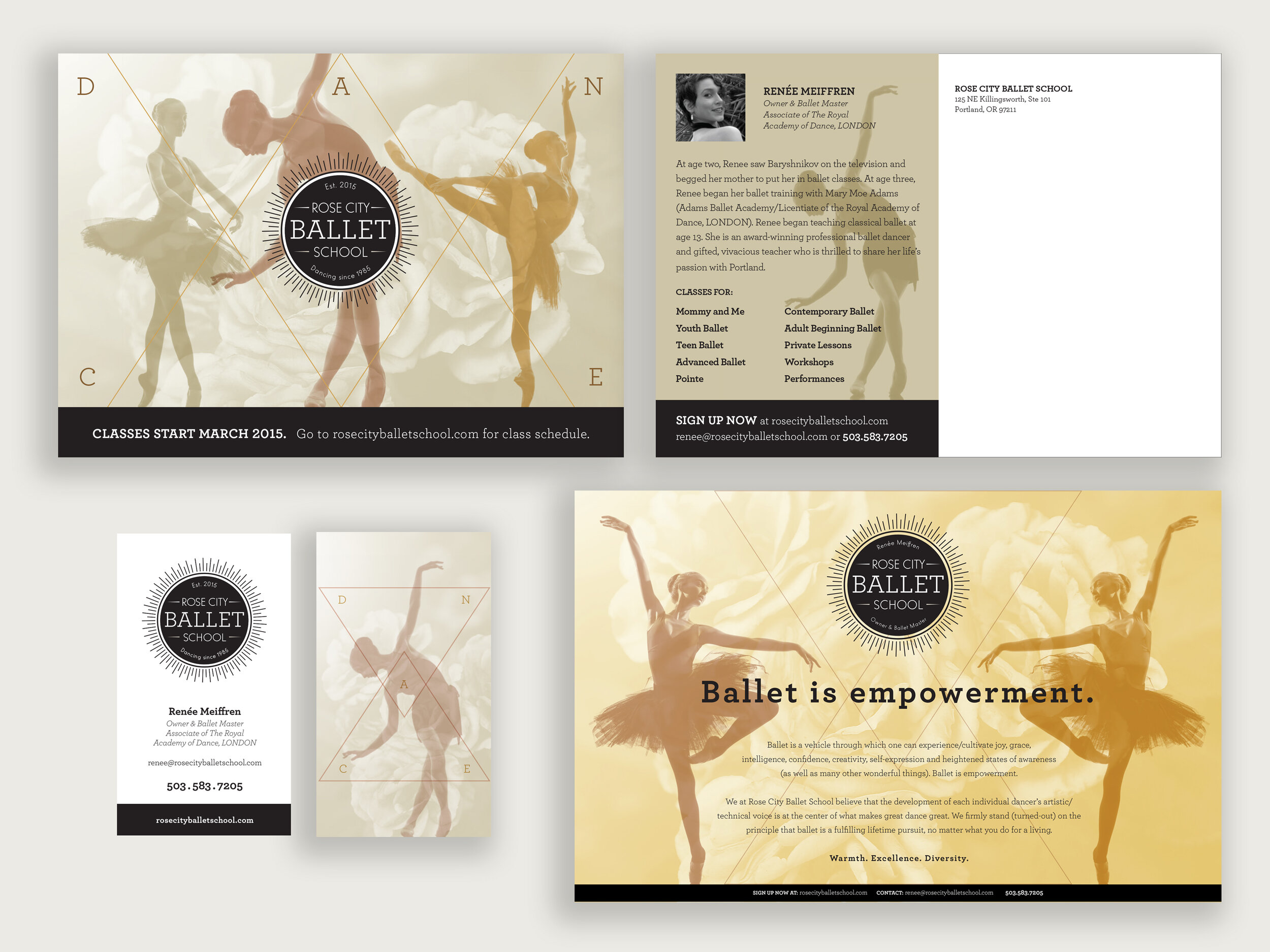
This was a great freelance opportunity, I was able to shape everything about this brand. I worked closely with the owner to create something that truly represented her as a person and as a dancer while also creating the school of her dreams. It was also ahead of its time in terms of diversity, equity and inclusiveness. Everyone was welcome at this school, no matter your talent level, age or size.

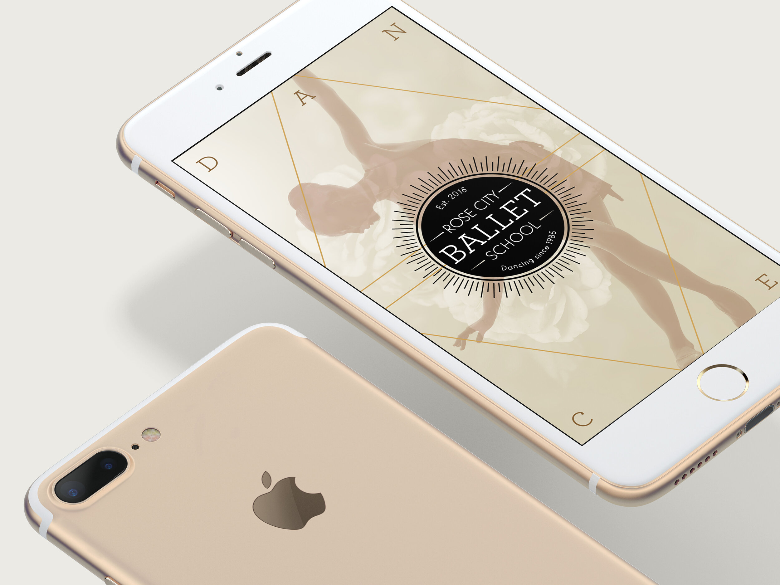
The logo incorporates the elements of the sun and geometry. It has a nod to the history while still staying modern. The multiplied silhouettes of the dancers plus the geometric shapes create a brand look that is soft yet sophisticated resulting in a flexible system. This has been a very successful brand, in three months from starting the school was making a small profit and now is completely full with a long waitlist. It has also moved into a bigger space and has been certified to teach the curriculum of the American Ballet Theater.
Creative Direction, Art Direction, Graphic Design, Branding, Logo Design, Advertising, Print, Retouching